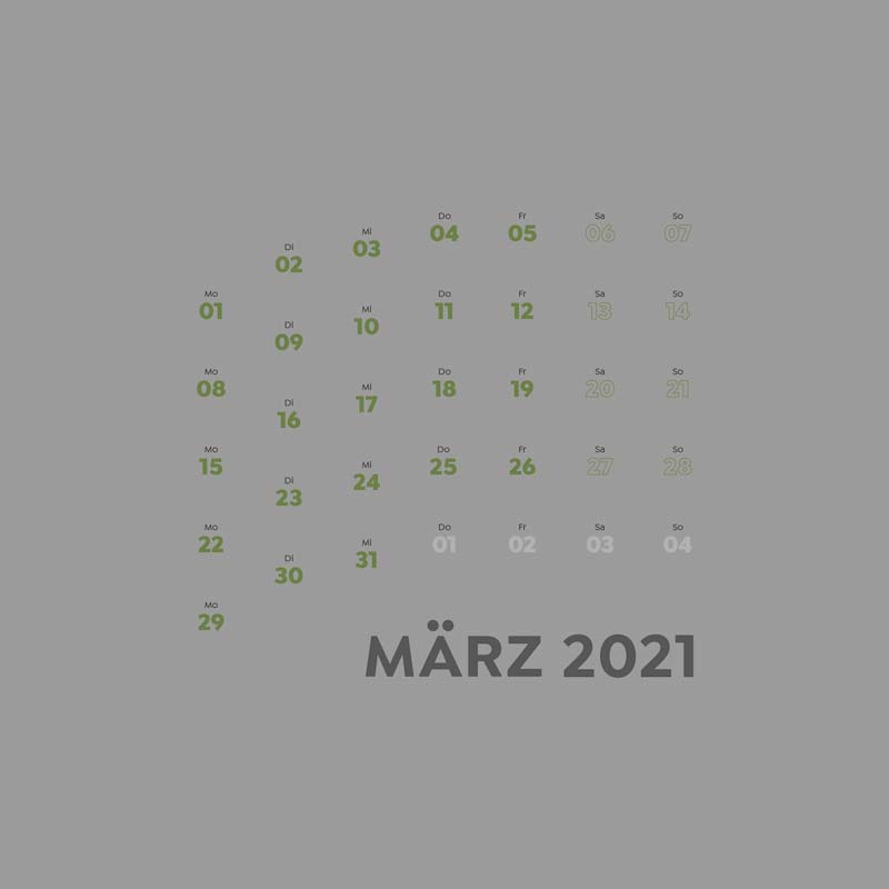
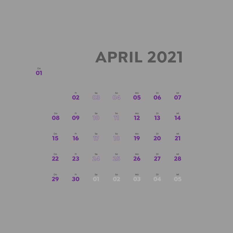
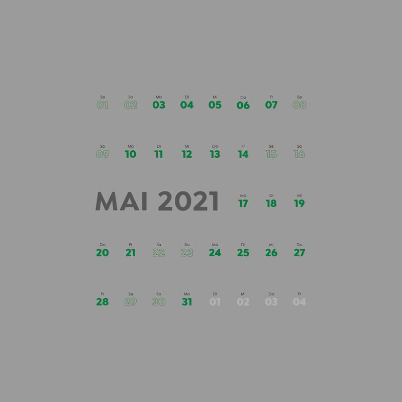
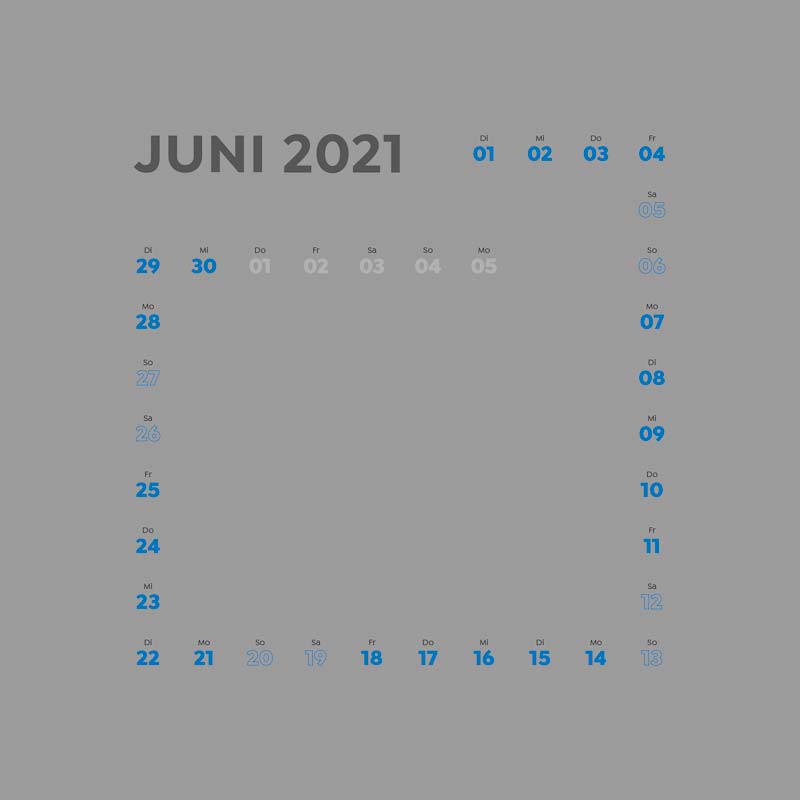
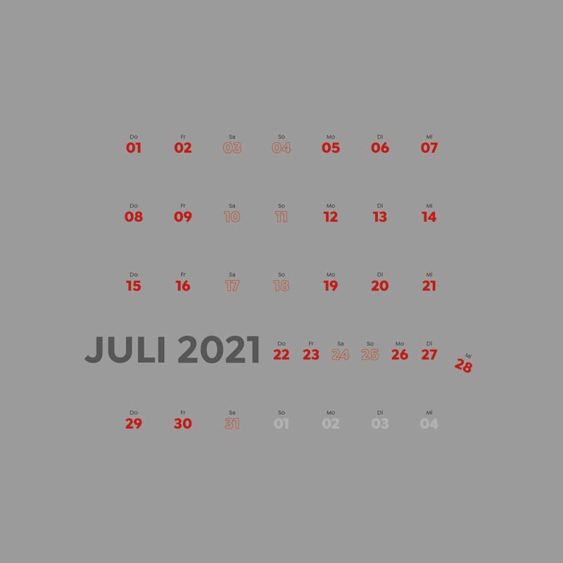
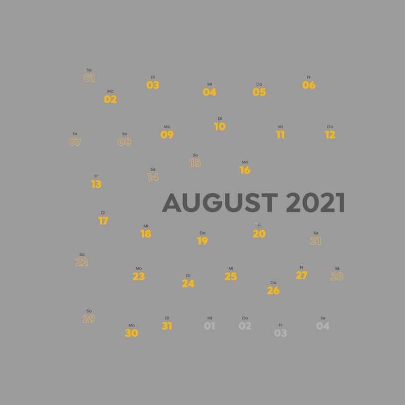
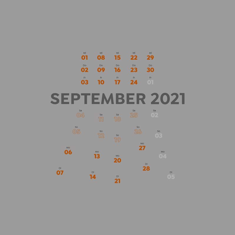
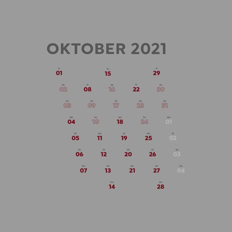
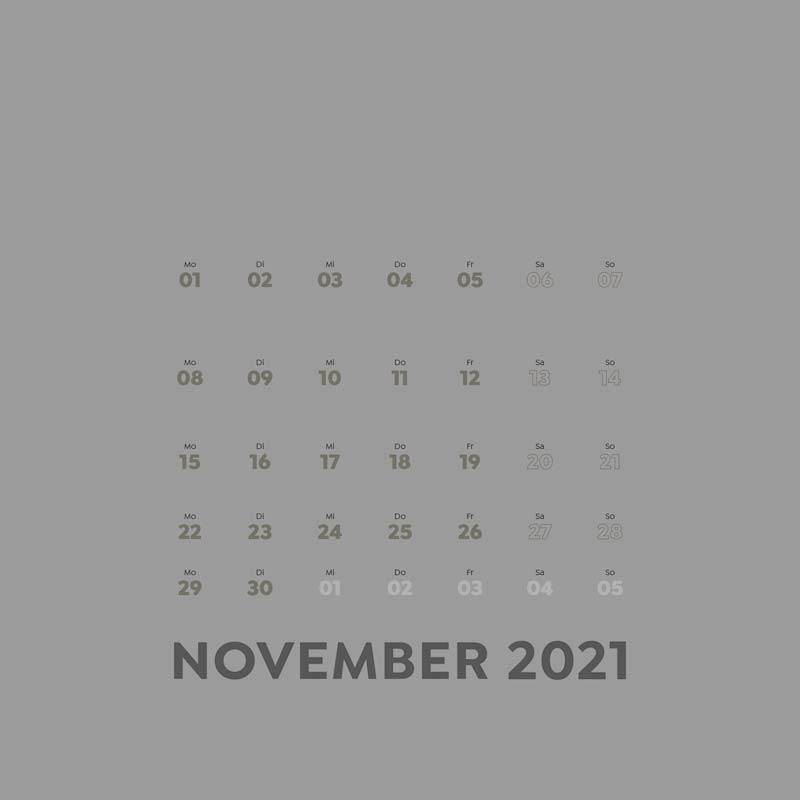
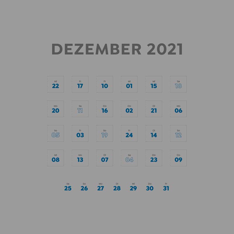
Excellent typography
21
Customer:
f+h Siebdruck GmbH, Maintal
Concept:
Dieter Fritzsche und Klaus Tietze
Design:
Klaus Tietze
Print:
f+h Siebdruck
Further processing:
Metallbau Schrottenbacher, Maintal
Jury comment:
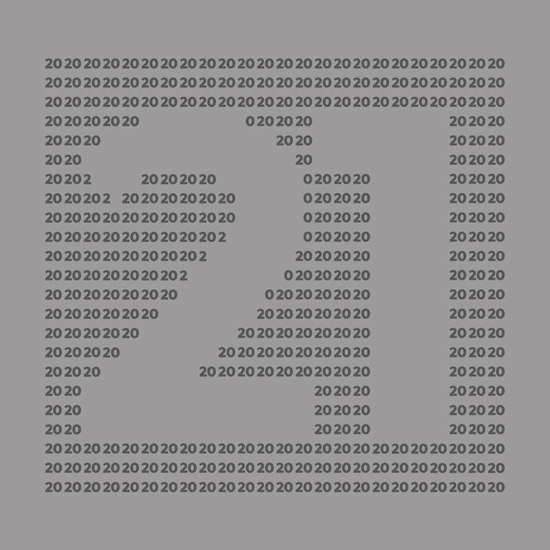
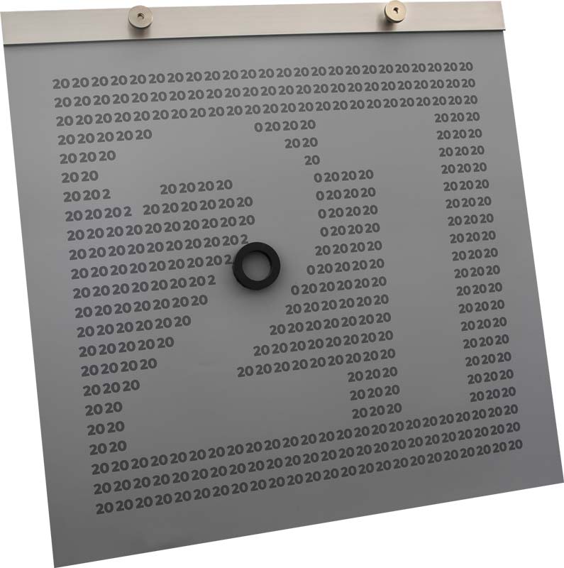
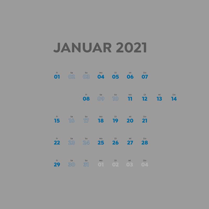
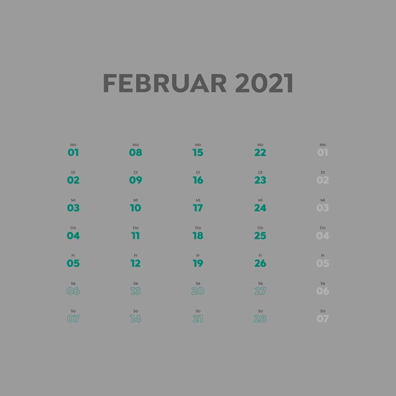
This calendar, as simple as it is noble, captivates by elevating its calendar to the star, downright celebrating it by typographically inserting it as a relevant design element into the geometry of the square calendar format. The reduced language of form, the restrained colorfulness of the paper as well as the use of metal as a carrier for the monthly pages, which remains as a pin board at the end of the year, will delight design fans.

